Emergence
Emergence
Emergence is the design system that runs Novensia. It's named for what it's trying to do — give one idea a visual form: something new forming out of something larger.
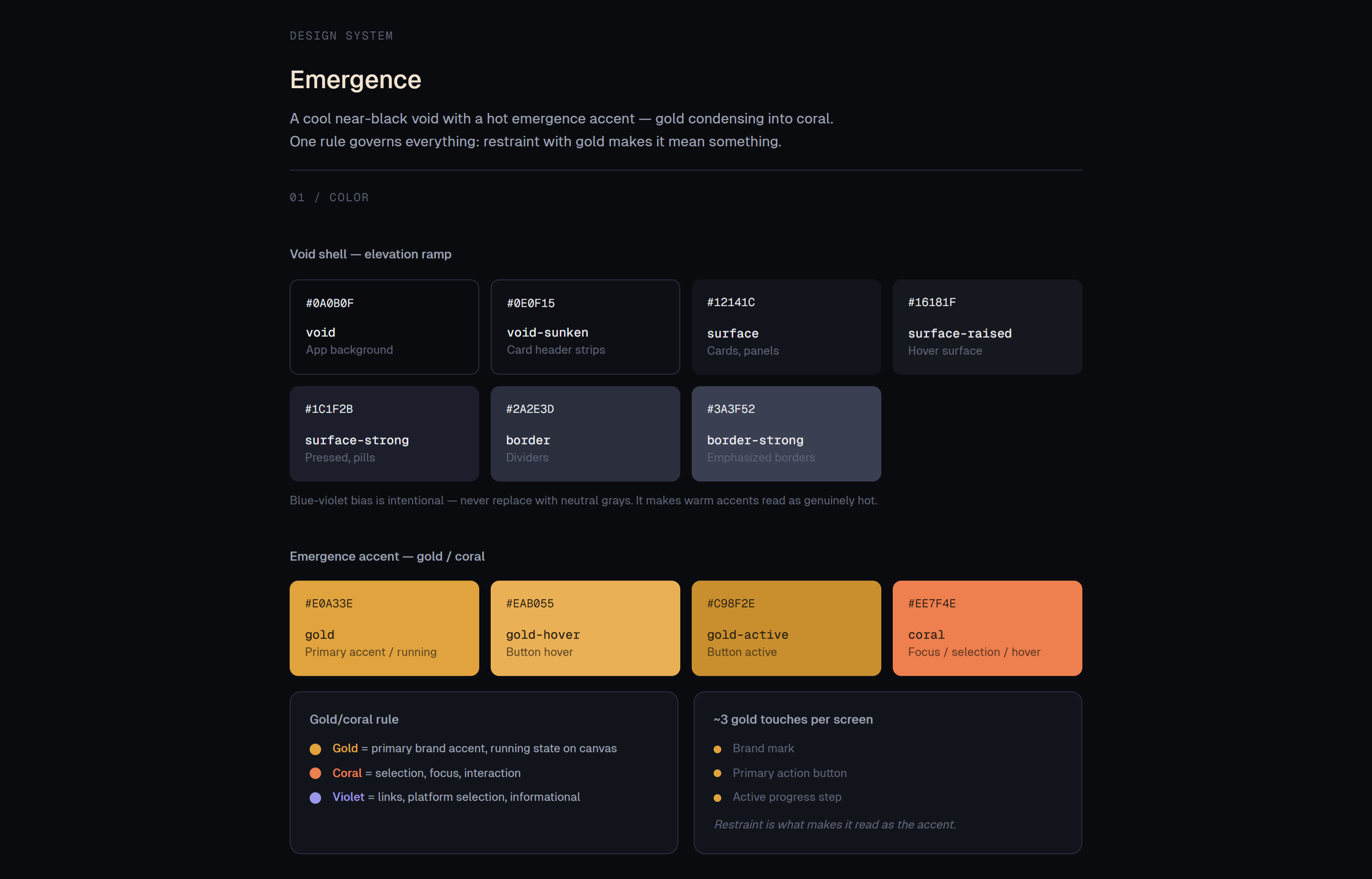
The system is a cool near-black void with a hot accent that condenses from gold into coral. The void recedes. The accent emerges. The content sits on top, bright and warm, because content is what the product is for. The whole system is dark-mode-first by intent, not by user preference — dark is what lets warm read as warm and content read as elevated.
The system came before the product. The thesis showed up before the working name did, which is why the tokens are namespace-generic. Whatever Novensia ends up being called, the system underneath doesn't have to change.
One rule, two contexts
The system runs on gold and coral, and one rule governs them: gold and coral split by context. On the node canvas, gold means running and coral means selected — so state lives on the node, interaction lives in a ring around it. Different layers, no collision: a node can be running and selected at once. Everywhere else, gold is the primary brand accent and coral is the secondary. One rule, applied two ways, holds the whole system together.
The grays carry a deliberate blue-violet bias — not neutral. That bias is what makes the warm accents read as genuinely hot. And gold gets used sparingly: roughly three touches per screen — the brand mark, the primary action, the active step. Restraint is what makes it read as the accent instead of decoration.
Type as category
Three typefaces, three jobs. Geist Sans for interface — labels, controls, headings. Newsreader for generated content — the draft, and nothing else. Geist Mono for machine values — model strings, temperatures, scores, JSON.
The rule that decides between them: a label is a word a human wrote ("Temperature"); a value is data the machine produced ("0.7"). Label gets Geist. Value gets Mono. The reader knows what kind of thing they're looking at before they read a word of it.
Two weights across all three faces — regular and medium. Emphasis comes from size, color, and the step between them, never a third weight.
Discipline
The system's point of view is mostly about restraint.
Gold touches about three things per screen. Two type weights, never three. Grays stay blue-violet-biased, never neutral. Red borders use a deep, desaturated red — full-strength red on the void buzzes, so it's reserved for dots, fills, and text where it carries a signal. Every one of these is a small "no" in service of the same goal: the content stays brightest, the accent stays the accent, nothing competes with the thing the user came to make.
The system is built from real primitives — the brand mark, the coral focus state, the gold button. Even the sign-in is assembled from the same parts, no decoration bolted on.