NEMO
A personal brand for John Nemo, built with a system I'm developing and steered by hand.
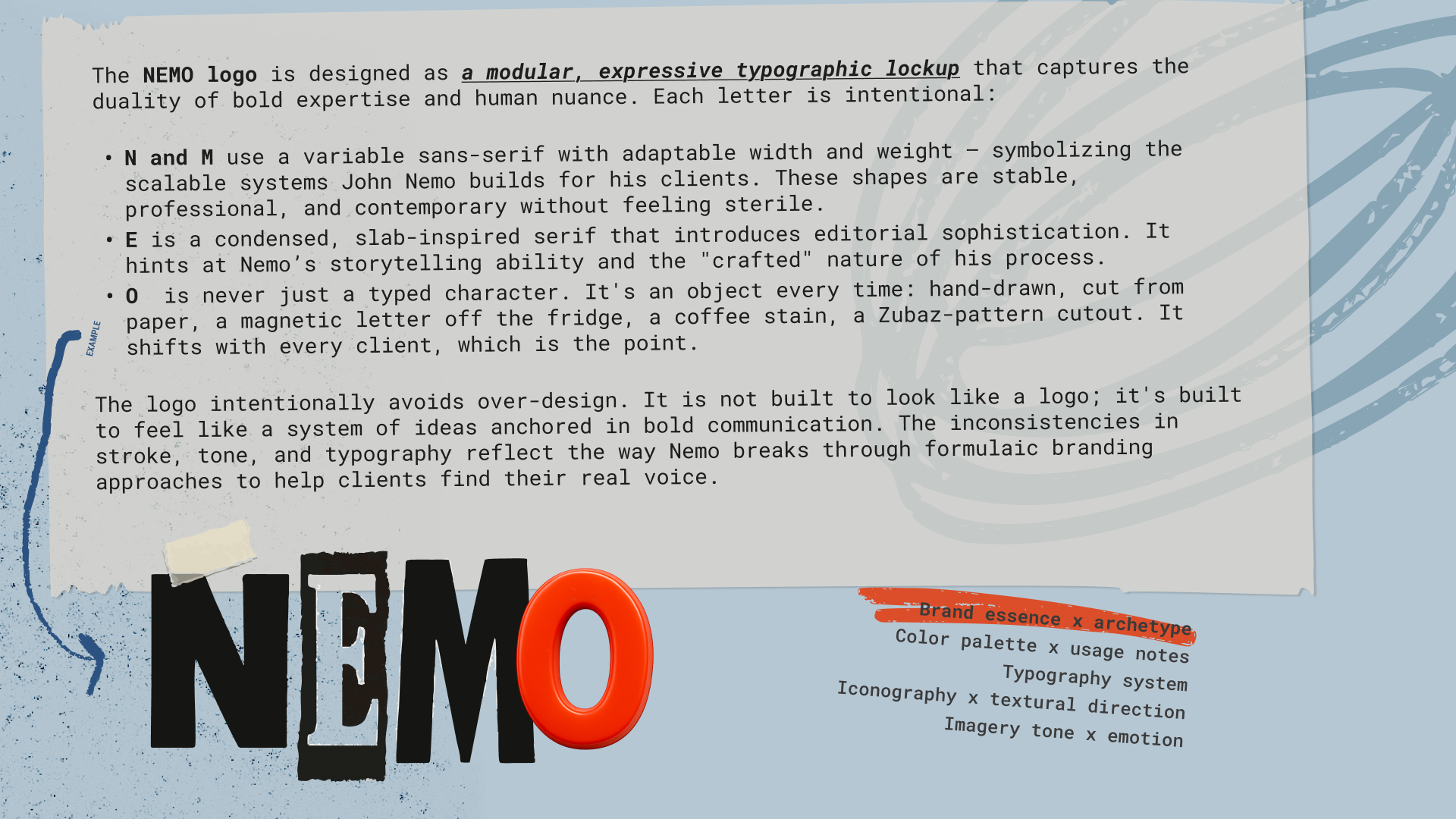
The NEMO logo is the place to start, because it makes the whole argument in one mark. Five letters, none of them behaving the same way. The N and M are a variable sans-serif that can shift width and weight. The E is a condensed slab serif. The O is never just a typed character. It's an object every time: hand-drawn, cut from paper, a magnetic letter off the fridge, a coffee stain, a Zubaz-pattern cutout. It shifts with every client, which is the point.
Nemo's whole pitch is that he breaks formulaic branding to help people find their real voice. A logo for that can't be one tidy lockup. The inconsistency is the system. The mark works because it refuses to settle, the same way he does.
Who this is for
John Nemo runs a LinkedIn lead-generation agency out of Minneapolis. He started it with one client and thirty days of money, and built it past seven figures. He's a former Associated Press reporter and the author of eight books. He wears Zubaz pants and mismatched t-shirts on purpose. He's a "just Jesus, not religion" guy who is careful never to preach. By his own account he has the worst fashion sense on the planet and a popcorn bucket he wears on his head.
That's a lot of person to put into a brand, and most of it would get sanded off by a normal process.
This brand didn't come from a moodboard. It came out of a system I'm building.
The system, and the part I keep by hand
The system is a brand operating system I'm developing. A client fills out an intake. The system reads it and returns the strategic core: the archetype, the positioning, the territory the brand should live in. I take that and art-direct it into the finished work.
I run stages of it by hand. Partly because the pipeline isn't fully automated yet, but mostly on purpose. Running it manually is how I see what the model gets right and where it drifts, and that's how I get the model right before I let it run on its own. The system can generate. It can't yet tell what's on-brand from what's almost. That read is the part I keep by hand, and it's the part that makes the output look like the work here instead of a prompt result.
There's a second kind of read the system can't do, and Nemo is the clearest example of it. The intake is all the system gets. From his, it returned a four-part archetype stack: Sage, Magician, Everyman, Jester. That's correct. But after spending real time around John, I merged two of them. The Everyman and the Jester aren't two sides of him. They're one person. The funny regular guy is the whole thing, and you only learn that by being in the room with him. The system reads what's written down. I can know what isn't.
Type
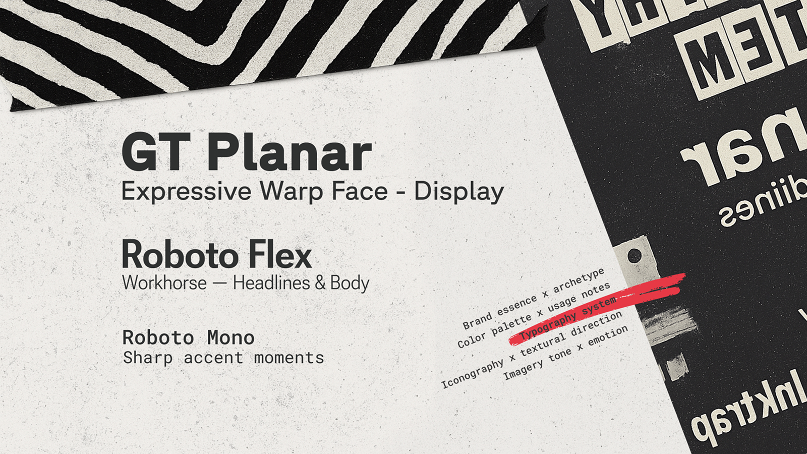
The system's type direction was reasonable. Bebas Neue for blocky zine headlines, Inter for clean body, Space Grotesk for accents. Three faces that match the adjectives in the brief: editorial, bold, raw. On paper it fits. In practice it would have built a stiff system: three static fonts, each doing one job, with no room to move.
I kept the intent and rebuilt the toolkit.
Most of the system runs on Roboto Flex, one variable font doing the work the brief split across two. Its range across weight, width, and optical size covers the clean blocky headline Bebas was there for and the readable body Inter was there for, in a single face. One file, more positions, a system that can flex instead of three that can't.
GT Planar comes in only where the page needs to break. Its slant axis runs backward through upright to forward, retalic to italic, and that back-slant is the whole reason it's here. It does on screen what happens when a page drags across the Xerox glass mid-copy: the skew and smear, type that looks reproduced rather than set. Bebas is one fixed cut. It can't warp. The zine look needs a face that can, so GT Planar is the expressive moment and Roboto Flex holds everything around it.
Accents went to Roboto Mono. Space Grotesk's clean right-angle descenders read contemporary, and against Xerox grit that's a tonal mismatch. A typewriter face brings the self-printed-mag rawness. But a distressed typewriter font is a costume. Roboto Mono keeps the typewriter DNA with a quiet modernity, so the accent reads raw without reading retro.
The system can pick fonts that match the words. It can't feel that Bebas and Inter would be too rigid to grow a system from, or that those clean descenders would fight the grit, or that the territory needs type that warps like a bad photocopy. That read is the part I keep by hand.
Color
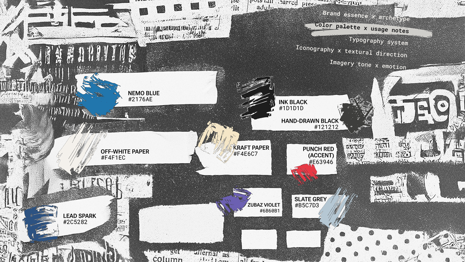
The system named the palette correctly. Blue for trust, red for conversion. Black for ink. The specific colors it picked were the problem. Its blue was #004DFF, a loud digital blue. Its red was #FF004D, a near-neon. Named right, chosen wrong: put those two next to each other and they vibrate. Both sit high and saturated, close in value, and the eye can't rest where they meet.
I pulled both toward ink. The blue became #2176AE, a printed, faded blue that reads like it came off a press instead of a screen. The red became #E63946 and got a new name. "Conversion Red" is funnel language. "Punch Red" is what the color does on the page. The rename is small, but it moves the palette out of marketing vocabulary and into editorial vocabulary, which is where the brand lives.
I split the black in two. Ink Black #1D1D1D for set type, Hand-Drawn Black #121212 for the marks meant to look made by hand, so the hand-drawn elements don't read as the same flat black as the body.
Then I added three colors the system never named: Zubaz Violet #6B60B1, Lead Spark #2C5282, and Slate Grey #B5C7D3. The violet is John's pants, pulled straight into the palette. The other two give an asset somewhere to go when it needs more range.
The creative direction said minimal color, and adding this much pushes against that rule. That was a real tradeoff, not an oversight. I widened the palette on client feedback and because some assets needed room to shift tone. Most of that room went to the paper colors, the off-white #F4F1EC and the kraft #F4E6C7, because they read as paper rather than color. They let a layout breathe without breaking the discipline the minimal-color rule was protecting.
Texture and imagery
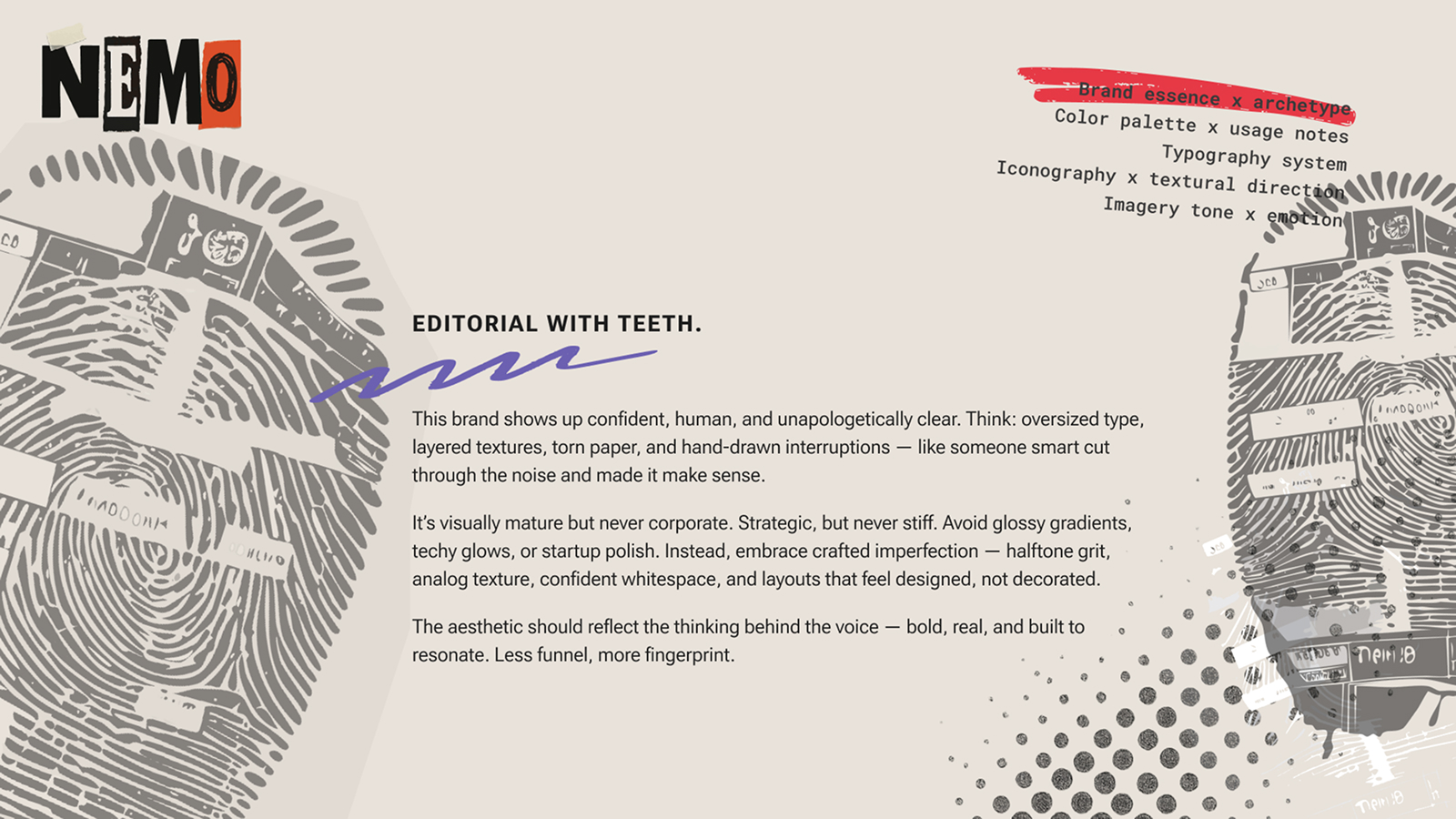
The texture system is where the brand stops looking designed and starts looking printed. Xerox grit is the primary texture, the grain you get dragging a page across a copier. Under it sit halftone dots, scanned paper, torn edges, masking tape. The rule behind all of it is one the deck states plainly: if it's too clean, it's too forgettable.
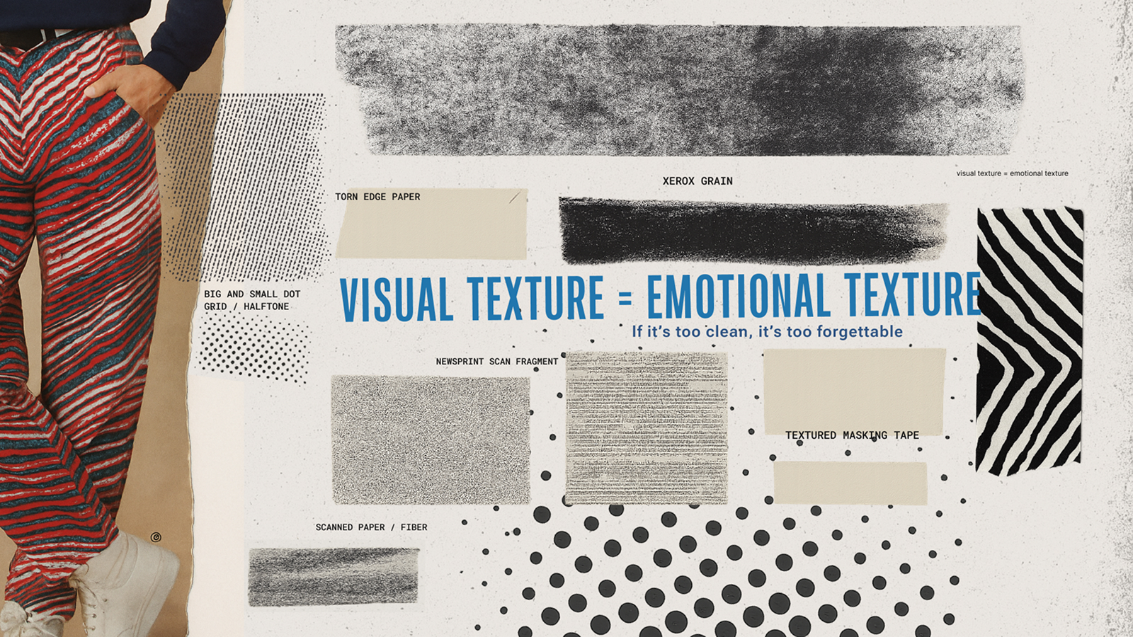
The fingerprint is the part I'm proudest of in this brand, because it started as a positioning idea and became a visual mark. John's whole argument is that he's the opposite of the spam-and-funnel marketers in his space. You're the prize, not the pursuer. No templates. The line for that is "less funnel, more fingerprint," and the fingerprint isn't only a line. It shows up as an actual texture in the work. A positioning idea you can see.
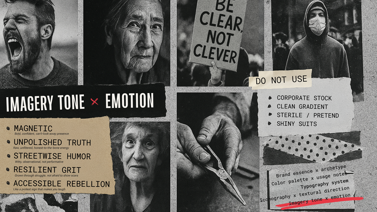
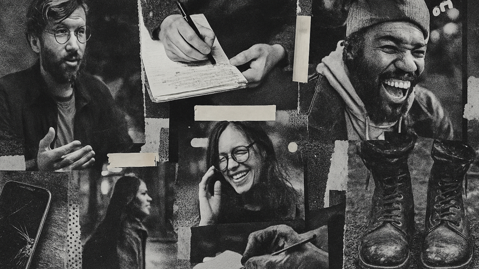
The imagery has a hard rule attached: real people, real expressions, teaching and conversation, never corporate stock. The photography runs monochrome so it reads as documentary rather than catalog. Color is allowed where an element looks hand-done or pasted up, but the people stay black and white.
The hardest constraint in the whole brand is the faith one. John is open about his faith and equally clear he never wants it to preach. So the brief is faith-informed and non-denominational at once: spiritual imagery only ever abstract, cropped, photocopied, never the focal point, the message always the hero. That's a narrow path to walk in art direction. Lean one way and it goes corporate-safe and says nothing. Lean the other and it turns into church branding. Holding the middle is the work.
How the words got made
Two things in this brand were made the way the whole system is meant to work, and they're worth being precise about.
The copy lines came out of a loop, not a single pass. "Editorial with teeth." "Less funnel, more fingerprint." "Be clear, not clever." None of those are first-draft system output, and none are written cold by me. I took the system's output and ran it back through, workshopping with AI in the loop until the lines were right. That back-and-forth is the method, not a shortcut around it.
And the brand logic itself, the archetype and positioning and territory, is the system's analysis, not my guess. What I added is the read the system can't do yet. It couldn't see that two of its archetypes were the same man, or feel that its colors vibrated. It couldn't tell that its type was too rigid to build a system on. AI is the material. The judgment is mine, and right now I keep it by hand on purpose, because that's how I tune the model and that's the quality bar the work has to clear.
The system can generate. It can't yet tell what's on-brand from what's almost. That read is the part I keep by hand, while I teach the rest of it to the model.