GPRS SiteMap
GPRS SiteMap
Ground Penetrating Radar Specialists scans what's underneath a job site — gas, water, electric, sewer, telecom — before anyone digs. SiteMap is the software product where all of that data lives: a map-first interface where building owners, contractors, and engineers can see the utilities and features GPRS captured, drill into work orders, manage their properties over time, and trust that what's on screen matches what's in the ground. Hundreds of thousands of records, scans, and assets flow through the system, across desktop, tablet, and mobile.
I joined SiteMap as Lead UX/UI Designer in 2023 for the redesign. The new version shipped in late 2024 and continued evolving from there as new functionality came online. I designed every interface across all three surfaces — desktop, tablet, mobile — and ran a weekly cadence with both the desktop and mobile dev teams to keep what they were building aligned with the UX, and to work through the design implications of decisions they were making.
The shape of the work
SiteMap was already in production when I came on. Customers were using it daily. The existing design team was strong — there were good ideas everywhere — but the product had grown without a design system underneath it, and the work had splintered. Different surfaces handled the same patterns differently. The same data appeared in incompatible ways across the product. Adding new features meant inventing each one almost from scratch, because the foundation to build up was crumbling.
The business wanted more, not less: a richer feature set, more granular permission levels, deeper subscription tiers, more of what users could do with the data. The redesign had to do two things at the same time — unify what was already there, and make room for everything coming next — without breaking the workflows customers already depended on.
That dual mandate ran through every decision. A from-scratch redesign would have been easier in some ways: no legacy to honor, no users to protect. This was the harder version. Bring coherence to something that's already working, while adding complexity the product hadn't been architected to support, and ship it without anyone feeling the floor shift underneath them.
How the product thinks
A few principles emerged from the redesign and held across the suite.
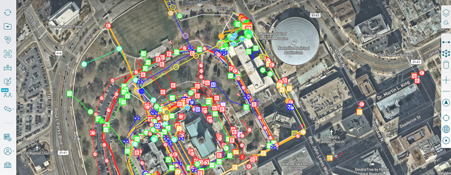
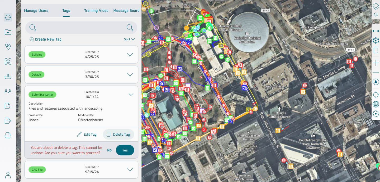
The map is the surface. SiteMap's entire premise is that the map is the source of truth — the satellite view of the site, with utility lines and feature markers layered on top, is where the user lives. Panels slide in over the map rather than replacing it. Detail views maintain the map's context. The reader never loses sight of where they are physically, because where they are physically is the whole point. Making the map the workspace was the design decision that everything else hung on.
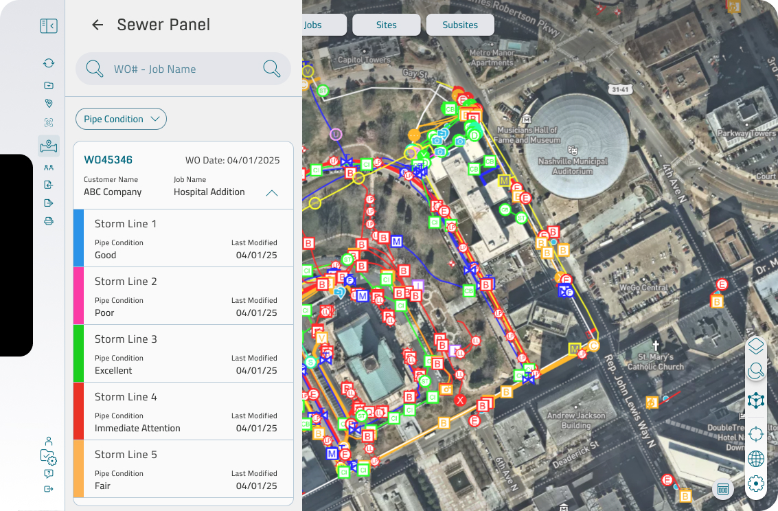
Color carries condition. Storm lines run down a vertical rail with their pipe condition color-coded — green for excellent, yellow for fair, red for immediate attention, and so on. The user scanning a sewer system isn't reading words; they're reading the rail. The condition language is consistent across utility types and across surfaces, so a field engineer on a phone and an estimator at a desk see the same colors meaning the same things.
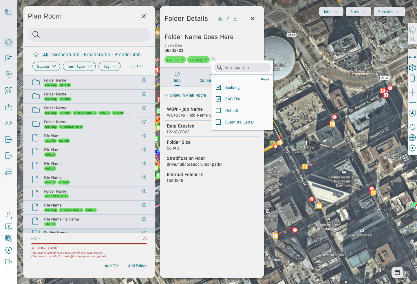
Tag-based organization, not folder trees. The Plan Room — where CAD files, submittals, building plans, and site documents live — uses tags rather than a deep folder hierarchy. Tags carry color identity, audit metadata, and a description, so a customer can find what they need without remembering whose computer it was filed on. The same tag system surfaces in Folder Details and in the Show in Plan Room cross-reference, so it works everywhere the user might look.
Performance is part of the design. A site can have thousands of features on the map at once. The Settings panel exposes the controls that make that workable — render scale, feature icon size, hide-removed-lines, low-memory mode — and the defaults are calibrated so the map stays usable without the user ever having to open the panel. The settings exist for the power user; the defaults exist for everyone else.
Cross-platform parity, not cross-platform identity. Desktop, tablet, and mobile share the same data model and the same language, but they don't try to be the same product. Desktop is where the heavy work happens: reviewing inspection videos, managing subscriptions, administering tags. Mobile is where the field happens: pulling up a line detail in the dirt, confirming a work order on site. Tablet sits between them, comfortable in both contexts. The design treats each surface as serious in its own right, not as a downsized version of the next one up.
What I built
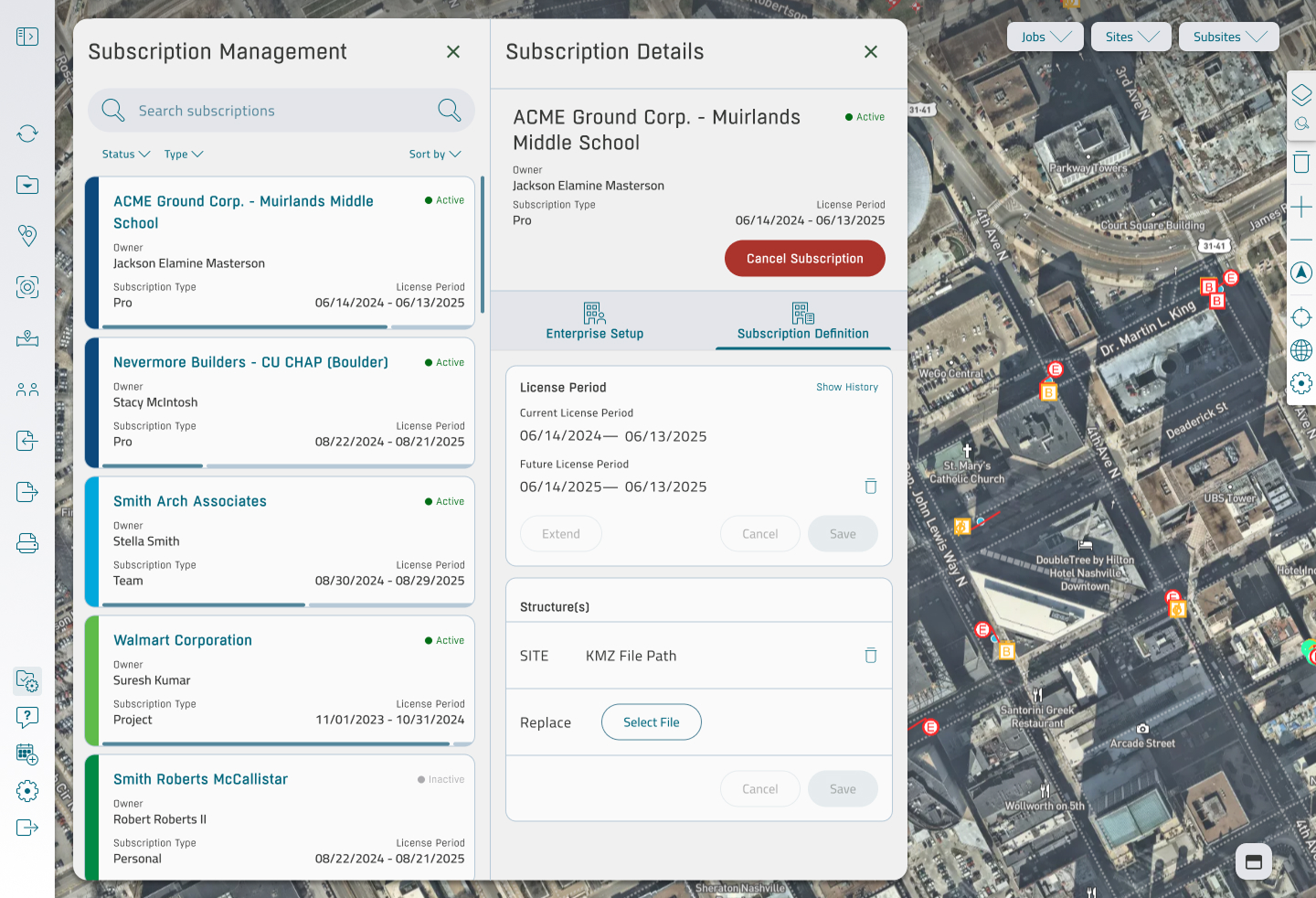
Across the redesign and the year of feature work that followed, the scope spanned the SiteMap canvas itself, the Plan Room file system, sewer and line detail with embedded inspection video and PACP observation codes, Reality Capture for point clouds and 3D scans, subscription management for the B2B SaaS side, an admin surface covering tags, user management, training, and messaging, multi-tier permissions, the settings layer that controls map performance, and on-canvas annotation tools.
All of it on three surfaces, all of it tied to the same data model, all of it produced by one design lead working with strong dev teams on each platform. The weekly reviews with desktop and mobile were where the design held: a place for the engineers to surface what they'd built or where they were stuck, and a place to make the calls that kept the surfaces aligned without grinding development to a stop.
What I take from it
Two things came out of this engagement that I've taken with me.
The first is that redesigning a live product is a different discipline than designing a new one. A new product gets to be perfect on day one because nobody is using it yet. A live product has to be better tomorrow than it was today without breaking the work people did yesterday. Every decision is weighted by the people already inside the product. That weight is what makes the work matter.
The second is that design coherence at this scope is mostly an alignment problem, not a drawing problem. The screens come together when the surfaces are reasoning from the same model. Most of the work was making sure that model held — across desktop, tablet, and mobile, across feature areas, across the developers building each piece — so that everything visible on the screen was the visible end of a deeper consistency underneath.
